Avatar
The Avatar component is used to represent people or entities by displaying images, initials, or icons.
Basic Usage
Avatar styles can be defined through the size, shape, backgroundColor, borderRadius, fallbackText, and icon properties.
Size
Avatars come in 7 preset sizes: xs, sm, md, lg, xl, 2xl, 3xl. The default size is md.
3xl
2xl
xl
lg
md
sm
xs
<template>
  <div class="flex gap-5">
    <div v-for="size in ['3xl', '2xl', 'xl', 'lg', 'md', 'sm', 'xs']" :key="size">
      <p class="text-center text-lg font-500">
        {{ size }}
      </p>
      <ol-avatar :size="size" src="https://i.postimg.cc/50sV11jF/pexels-photo-128302.jpg" />
    </div>
  </div>
</template>
Shape
There are two types of Avatars: circle, and square. The default type is circle.
circle
square
<template>
  <div class="flex gap-4 items-center">
    <div v-for="shape in ['circle', 'square']" :key="shape">
      <p>{{ shape }}</p>
      <ol-avatar src="https://i.postimg.cc/50sV11jF/pexels-photo-128302.jpg" :shape />
    </div>
  </div>
</template>
Background Color
The backgroundColor attribute allows you to set the background color of the avatar.
<template>
  <div class="flex gap-4 items-center">
    <ol-avatar icon="i-mi-user" />
    <ol-avatar icon="i-mi-user" background-color="#ef4444" />
    <ol-avatar icon="i-mi-user" background-color="#f59e0b" />
    <ol-avatar icon="i-mi-user" background-color="#84cc16" />
    <ol-avatar icon="i-mi-user" background-color="#06b6d4" />
  </div>
</template>
Border Radius
The borderRadius attribute allows you to set the border radius of the avatar.
5 px
15 px
25 px
35 px
<template>
  <div class="flex gap-4 items-center">
    <div class="flex flex-col gap-2">
      <p>5 px</p>
      <ol-avatar src="https://i.postimg.cc/50sV11jF/pexels-photo-128302.jpg" border-radius="5" />
    </div>
    <div class="flex flex-col gap-2">
      <p>15 px</p>
      <ol-avatar src="https://i.postimg.cc/50sV11jF/pexels-photo-128302.jpg" border-radius="15" />
    </div>
    <div class="flex flex-col gap-2">
      <p>25 px</p>
      <ol-avatar src="https://i.postimg.cc/50sV11jF/pexels-photo-128302.jpg" border-radius="25" />
    </div>
    <div class="flex flex-col gap-2">
      <p>35 px</p>
      <ol-avatar src="https://i.postimg.cc/50sV11jF/pexels-photo-128302.jpg" border-radius="35" />
    </div>
  </div>
</template>
Fallback Text
The fallbackText attribute allows you to display a fallback text if the image fails to load.
<template>
  <div class="flex gap-4 items-center">
    <!-- Image error will show initials -->
    <ol-avatar
      src="/invalid-image.jpg"
      initials="Buzz Lightyear"
      background-color="#0ea5e9"
    />

    <ol-avatar
      src="/invalid-image.jpg"
      initials="Buzz-Light_Year"
      background-color="#0ea5e9"
    />

    <!-- Image error will show icon -->
    <ol-avatar
      src="/invalid-image.jpg"
      icon="i-mi-user"
      background-color="#10b981"
    />

    <!-- Image error will show text -->
    <ol-avatar
      src="/invalid-image.jpg"
      fallback-text="User"
      background-color="#f59e0b"
    />
  </div>
</template>
Icon
The icon attribute allows you to display an icon instead of an image.
<template>
  <div class="flex gap-4 items-center">
    <ol-avatar icon="i-mi-user" />
  </div>
</template>
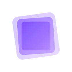
Outlined
The outlined attribute allows you to display an outlined avatar.
<template>
  <div class="demo-avatar-outline">
    <ol-avatar
      src="https://i.postimg.cc/50sV11jF/pexels-photo-128302.jpg"
      size="2xl"
      outlined
    />
    <ol-avatar
      src="https://i.postimg.cc/50sV11jF/pexels-photo-128302.jpg"
      size="2xl"
      outlined
      outline-color="#ef4444"
    />
    <ol-avatar
      src="https://i.postimg.cc/50sV11jF/pexels-photo-128302.jpg"
      size="2xl"
      outlined
      outline-style="gradient"
    />
    <ol-avatar
      src="https://i.postimg.cc/50sV11jF/pexels-photo-128302.jpg"
      size="2xl"
      outlined
      outline-width="6"
      outline-style="gradient"
      outline-gradient="linear-gradient(45deg, #f97316, #ec4899)"
    />
    <ol-avatar
      src="https://i.postimg.cc/50sV11jF/pexels-photo-128302.jpg"
      size="2xl"
      outlined
      outline-width="5"
      outline-color="rgba(80, 200, 50, 0.9)"
    />
  </div>
</template>

  <style scoped>
  .demo-avatar-outline {
    display: flex;
    gap: 16px;
    align-items: center;
  }
  </style>
Avatar Group
Avatar Group is used to display a group of avatars in a single component.It is particularly suitable for displaying a group of people or entities in a compact and visually appealing way.
<template>
  <div class="flex items-center">
    <ol-avatar-group>
      <ol-avatar icon="i-mi-user" background-color="green" />
      <ol-avatar icon="i-mi-user" background-color="lightcoral" />
      <ol-avatar icon="i-mi-user" background-color="lightseagreen" />
      <ol-avatar icon="i-mi-user" background-color="lightsalmon" />
      <ol-avatar icon="i-mi-user" background-color="lightsteelblue" />
      <ol-avatar icon="i-mi-user" background-color="lightpink" />
    </ol-avatar-group>
  </div>
</template>
Attributes
| Attribute | Description | Type | Default |
|---|---|---|---|
| src | Image URL | string | - |
| alt | Alternative text for image | string | - |
| initials | Initials to show when no image | string | - |
| icon | Icon name to display | string | - |
| fallbackContent | Fallback content | string | - |
| size | Avatar size, can be xs, sm, md, lg, xl, 2xl, 3xl | string | number | md |
| shape | Avatar shape, can be circle or square | string | circle |
| backgroundColor | Background color | string | #101 |
| borderRadius | Custom border radius | string / number | - |
| outlined | Whether avatar is outlined | boolean | false |
| outlineColor | Outline color | string | #ccc |
| outlineWidth | Outline width | number | 3 |
| outlineStyle | Outline style, can be solid or gradient | string | solid |
| outlineGradient | Outline gradient | string | linear-gradient(45deg, #3b82f6, #8b5cf6) |
| clickable | Whether avatar is interactive | boolean | false |
| ariaLabel | ARIA label for accessibility | string | - |
Avatar Group
| Attribute | Description | Type | Default |
|---|---|---|---|
| overlap | Overlap size between avatars | string | 30 |
Events
| Name | Description | Parameters |
|---|---|---|
| click | Triggered when clicked (only if clickable is true) | (event: MouseEvent) |
| error | Triggered when image fails to load | - |